
Let’s be honest, choosing what colors to paint a kitchen is about a lot more than just staring at a wall of swatches at the hardware store. It’s about how your home feels on a rainy Tuesday morning or when you’re hosting a big family dinner. At Bates Painting, we’ve spent years specializing in interior painting, and we’ve seen firsthand how the right shade can take a kitchen from feeling dark and cramped to being that bright, breezy spot where everyone naturally ends up hanging out.
The kitchen is the workhorse of the home. It’s where the coffee is brewed, the homework is finished, and the best conversations happen over a shared meal. Because this room does so much, the color needs to do more than just look “pretty”, it needs to work with your lighting and set the right tone for your day.
Whether you’re planning a full-scale renovation or a simple weekend refresh, understanding how color interacts with light and mood is essential. In this detailed guide, our painters will explore the best choices for your kitchen walls and cabinetry to ensure your space feels intentional, stylish, and perfectly tailored to your lifestyle.
What Colors to Paint a Kitchen
When people ask us what colors to paint a kitchen, they are often looking for a way to make the space feel bigger or more modern without it feeling cold. For 2026, the trend is moving away from that “sterile hospital” white and toward colors that feel like a warm hug.
1. Warm “Mushroom” Neutrals
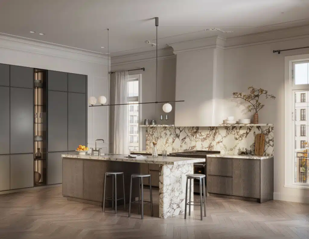
If you want that clean look but hate the idea of a clinical white, look at mushroom or soft taupe shades.
Imagine a kitchen with white subway tile and dark wood floors. A mushroom tone on the walls bridges that gap perfectly. It hides the occasional splash of pasta sauce better than pure white, and it glows beautifully under under-cabinet LED lighting.
These tones have a high enough Light Reflectance Value (LRV) to keep a small kitchen feeling open, but they have enough “pigment” to not wash out when the afternoon sun hits them.
2. Deep “Navy” and “Ink” Islands
One of the most popular interior painting requests we get is for a “two-tone” kitchen. This is where the perimeter cabinets are a light color, but the island is a dark, moody blue.
For example, a navy island acts like a piece of furniture. It anchors the room. If you have white quartz countertops, a deep blue base makes the “veining” in the stone look much more expensive. It’s a classic look that feels incredibly sophisticated but still hides the scuff marks from kids’ shoes at the breakfast bar.
3. Sage and Olive: The “Gardener’s” Kitchen
Green is everywhere right now, and for good reason. It’s calming and feels organic.
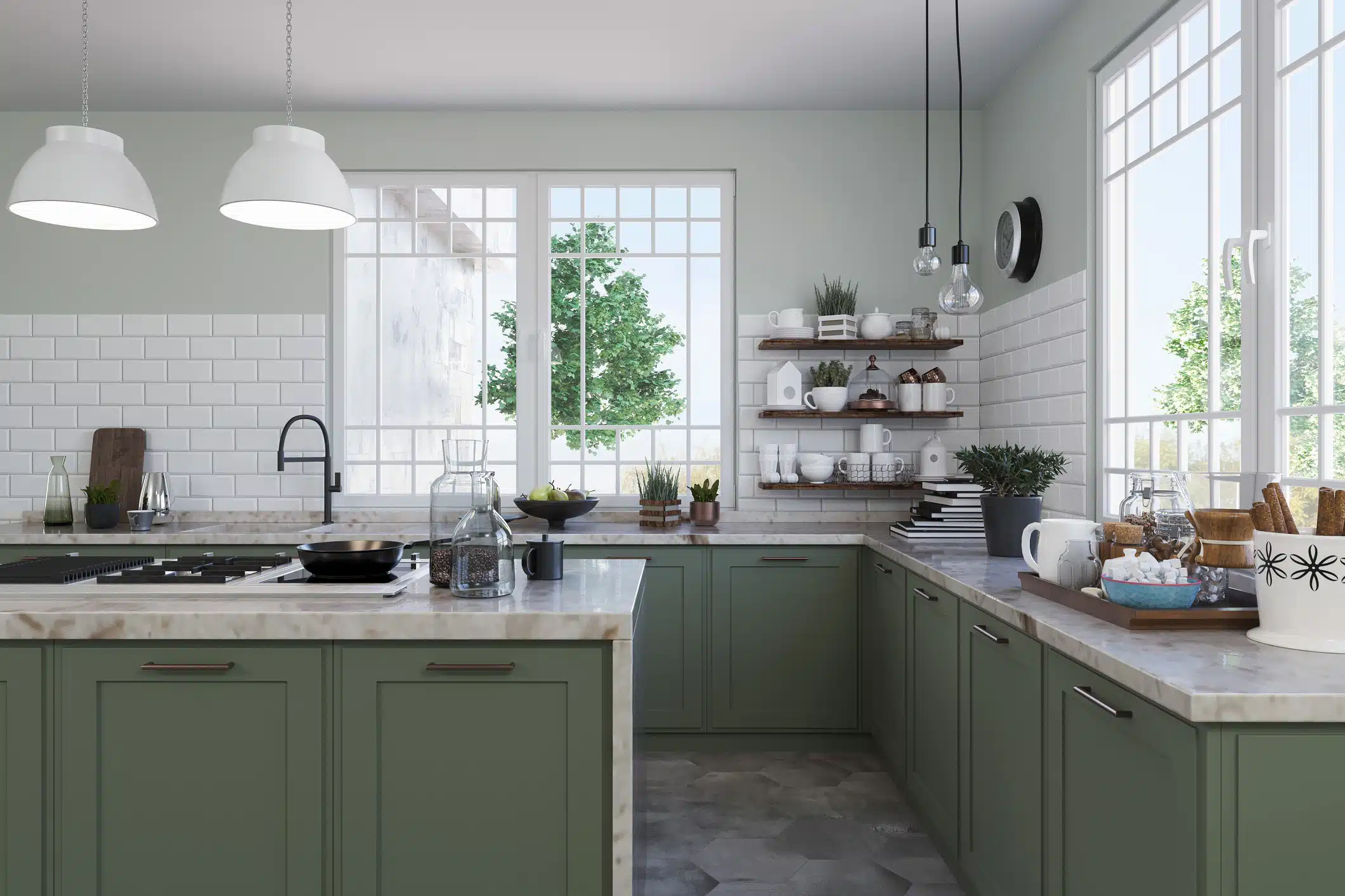
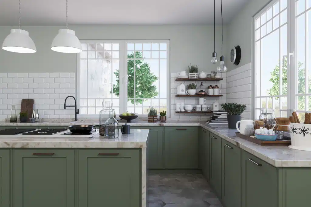
Sage green is a miracle worker for kitchens with lots of natural wood. If you have oak cabinets that you aren’t ready to paint yet, a soft sage on the walls actually “tames” the orange tones in the wood. It creates a farmhouse or cottage vibe that feels fresh and timeless.
How Interior Painting Changes Your Kitchen’s Lighting
Light is the “make or break” factor in kitchen design. You can pick the most beautiful color in the world, but if your kitchen faces north and gets no sun, a cool gray is going to look like a gloomy basement.
Dealing with Dark Corners in a Kitchen
Most kitchens have that one corner (usually near the pantry or the fridge)) that always feels like a shadow. When we handle an interior painting project, we recommend using a “satin” finish in these areas. Satin has a slight pearl-like sheen that catches what little light is available and bounces it back into the room.
The Impact of Kitchen Backsplashes
Your paint color needs to “talk” to your backsplash. If you have a busy, colorful tile, your wall color should be the “quiet” supporting actor. If your backsplash is simple white tile, your walls can be the star of the show with a bolder “Terracotta” or “Dusty Blue.”
Setting the Kitchen Mood: From Morning Coffee to Late-Night Snacks
The mood of your kitchen changes throughout the day, and your paint should be able to keep up.
- Energetic Mornings: Soft yellows or “Buttermilk” creams are great for people who aren’t “morning people.” These colors feel like artificial sunshine, making the kitchen feel bright and energizing even at 6:00 AM.
- Relaxed Evenings: If your kitchen is where you wind down with a glass of wine while cooking dinner, consider “Moody” tones like Charcoal or Forest Green. When the overhead lights are dimmed and the pendant lights are on, these colors create a cozy, “high-end restaurant” atmosphere.
How to Make a Small Kitchen Feel Huge
We often get asked what colors to paint a kitchen that is narrow or lacks windows. The “human” answer? Stop trying to make it white. Sometimes, leaning into the smallness with a mid-tone color like “French Blue” or “Warm Greige” makes the room feel intentional and cozy rather than “small and white.”
The Monochromatic Trick
One trick we use at Bates Painting is painting the walls and the trim the exact same color. When there is no white trim to “break up” the view, your eye doesn’t see where the wall ends and the ceiling begins. This creates an illusion of endless space.
Why Kitchen Details Matter with Interior Painting
When you’re planning your Kitchen painting project, think about the “supporting” elements that make the color pop.
- Hardware: A navy cabinet looks totally different with chrome handles (cool and modern) than it does with brass handles (warm and traditional).
- The Ceiling: Don’t forget the “fifth wall.” A soft cream ceiling is much more inviting than a stark, flat “ceiling white.”
- The Floor: If you have gray tile floors, stay away from yellow-based wall colors, or they will clash. Stick to “cool” neutrals.
Final Thoughts: Finding Your Kitchen Color Palette
When you decide what colors to paint your kitchen, you are setting the stage for years of dinners, holiday gatherings, and quiet morning coffees. Whether you lean toward the moody sophistication of a dark teal or the airy warmth of a mushroom neutral, your choice should reflect your personality.
At Bates Painting, we are more than just painters; we are your partners in design. Our team is dedicated to providing the highest quality both interior painting services and custom color consultations, helping you navigate the endless sea of swatches to find the one that makes your kitchen feel like home.
Ready to start your kitchen transformation? Contact Bates Painting today for a professional color consultation and a free estimate. Let’s make your 2026 kitchen vision a reality.
Why the Paint Professionals at Bates Painting are Different
Painting a kitchen isn’t like painting a bedroom. You’re dealing with grease, steam, food splatters, and heavy foot traffic. You need a team that understands the “prep” side of the job. At Bates Painting, we don’t just slap paint on the walls. We degrease the surfaces, sand the trim, and use high-durability finishes that can stand up to a damp cloth and a scrub brush.
Ready to give your kitchen a new lease on life? Contact Bates Painting today for a friendly consultation and a free quote. We can’t wait to help you transform your space!
Kitchen Interior Painting FAQs
1. What is The Most “Timeless” Color for a Kitchen?
You can never go wrong with a “Warm White” or a “Light Greige.” These colors have stayed popular for decades because they allow you to change your decor (towels, rugs, stools) without ever having to repaint the walls.
2. Does the Paint Finish Really Matter?
Yes! For interior painting in a kitchen, always go with Satin or Semi-Gloss. Flat paint in a kitchen is a recipe for disaster—one splash of grease and you’ll have a permanent stain.
3. How Often Should a Kitchen Be Repainted?
In most homes, a kitchen should undergo professional interior painting every 5 to 7 years. Because the kitchen is a high-traffic area subjected to heat, steam, and cooking grease, the paint film can wear down faster than in a bedroom or living room. If you notice “flashing” (uneven shiny spots) or if the paint behind the stove is difficult to clean, it is likely time for a refresh.
4. Should I Paint My Kitchen Cabinets or Just the Walls?
This depends on your goals for light and style. If your cabinets are structurally sound but look dated (like 1990s honey oak), painting them is the most cost-effective way to modernize the room. When deciding what colors to paint a kitchen, many homeowners find that keeping walls neutral and painting the cabinets a bold color like navy or sage provides the most “designer” look.
5. How Do I Make Sure My Paint Color Doesn’t Clash With My Backsplash?
This is one of the most common “oops” moments in interior painting. Your backsplash is a permanent fixture, so it should always dictate your paint choice, not the other way around. If your backsplash has a lot of movement—like a veined marble or a colorful mosaic—you’ll want to pull a subtle, quiet neutral from the tile for your walls. However, if you have a simple white subway tile, you have a “blank canvas” and can afford to be much bolder with your wall color. We always recommend taping your paint swatches directly next to your tile and looking at them at different times of the day to make sure the undertones (like pink, green, or blue) play nice together.