

Walking into a room and feeling that immediate sense of “home” isn’t an accident. It’s the result of a thoughtful blend of light, architecture, and—most importantly—color. At Bates Painting Company, we believe that choosing a paint color should be more than a chore; it should be a creative journey. After all, your home is your canvas, and the right hue is the first step in turning a simple room into a work of art.
But we know how it goes. You walk into the paint store, face a wall of three thousand “slightly different” whites, and suddenly, decision paralysis sets in. Do you want Swiss Coffee or Cloud White? Is that a green undertone or just the fluorescent lighting?
If you’re feeling overwhelmed, take a deep breath. Whether you’re refreshing a historic Brookside Tudor or bringing a modern edge to a home in Leawood, selecting the perfect palette is about understanding how color interacts with your unique space.
Here is our expert guide on how to choose the right paint color for your home, infused with the artistic perspective we bring to every project.
Start with Painting Inspiration (Not the Paint Aisle)
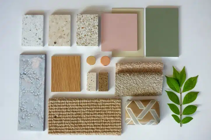
One of the biggest mistakes homeowners make is starting at the hardware store. Those tiny 2-inch swatches under flickering fluorescent lights are not your friends. Instead, start where you are most comfortable: your own home.
Look at the items you already love. Do you have a favorite Persian rug? A piece of local Kansas City art? A throw pillow that always makes you smile? These items often contain the “anchor colors” that naturally appeal to your aesthetic.
Create a Vision Board
Before you pick up a brush, gather your thoughts. Use Pinterest, Instagram, or even physical clippings to see what common threads emerge. You might notice you’re consistently drawn to moody, atmospheric blues or perhaps light, airy “earthy” neutrals. Seeing these colors grouped together helps you visualize the “vibe” of the room before a single drop of paint touches the wall.
Choosing Paint Colors for Interior Painting: The Artist’s Approach
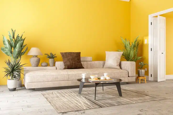
When we approach interior painting, we look at more than just the walls. We look at the “fixed elements”—the things that aren’t changing, like your hardwood floors, granite countertops, or that beautiful brick fireplace. Your paint color needs to be a supporting actor to these stars.
1. Identify the Undertones
This is where the magic (and the frustration) happens. Every paint color has a “mass tone” (the color you see) and an “undertone” (the color that hides beneath it). A gray isn’t just gray; it can be a blue-gray, a green-gray, or a purple-gray.
- Pro Tip: To find the hidden undertone, look at the darkest color on the paint strip. If the darkest shade looks like a deep chocolate brown, your lighter neutrals on that strip will have warm, brown undertones.
2. The Power of Lighting
Light is the most transformative element in interior design. A color that looks like a soft sage in a south-facing sunroom might look like a cold, muddy forest green in a north-facing basement.
- North-Facing Rooms: These get cool, bluish light. Lean into warmer tones to prevent the room from feeling “flat.”
- South-Facing Rooms: These are flooded with intense, warm light. This is the perfect place for cool blues or crisp whites that won’t turn “yellow” under the sun.
3. Consider the Mood and Function
Ask yourself: How do I want to feel in this room?
- Social Spaces (Kitchen/Dining): These benefit from “active” colors. Warm whites, buttery yellows, or even a bold terracotta can stimulate conversation and appetite.
- Private Retreats (Bedrooms/Bathrooms): Think “serene.” Cool blues, soft greens, and muted lavenders lower the heart rate and promote relaxation.
Choosing Paint Colors for Exterior Painting: Curb Appeal and Context
Selecting colors for exterior painting is a different beast entirely. Unlike your living room, where you control the light, your home’s exterior is at the mercy of the Kansas City sun, the changing seasons, and the surrounding landscape.
1. Work with Your Home’s Architecture
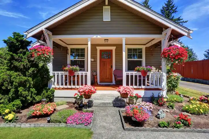
Is your home a classic Victorian, a mid-century modern ranch, or a stately Colonial? Your color palette should honor those bones. For example, historic homes often look best with a multi-tonal approach—one color for the body, a contrasting color for the trim, and a “pop” color for the front door to create a focal point.
2. The “Rule of Three”
For a professional, cohesive look, we typically recommend a three-color palette:
- The Field Color: This is the dominant color (the siding or brick).
- The Accent Color: Used for shutters, doors, and smaller architectural details.
- The Trim Color: Used for window frames, roof lines, and railings. Usually, a crisp white or a deep black provides the best “frame” for the field color.
3. Test in the Wild
Exterior colors often look two shades lighter once they are applied to a large surface in direct sunlight. Never choose an exterior color based on a swatch alone. We recommend painting a large sample (at least 2′ x 2′) on different sides of your house to see how it looks at noon versus sunset.
Quick Reference: Color & Their Use
| Color Family | Mood/Feeling | Best For… |
| Warm Neutrals (Beige, Taupe) | Inviting, Cozy, Stable | Living Rooms, Entryways |
| Cool Blues | Calm, Trustworthy, Airy | Bedrooms, Home Offices |
| Earthy Greens | Refreshing, Balanced, Natural | Kitchens, Sunrooms |
| Deep Hues (Navy, Charcoal) | Dramatic, Sophisticated, Bold | Accent Walls, Dining Rooms |
| Crisp Whites | Clean, Modern, Versatile | Trim, Small Bathrooms |
The “Overthinker’s” Strategy: Sampling the Right Way
If you’re still worried about making the “wrong” choice, stop painting small squares directly on your white walls. The existing wall color will bleed through and distort your perception of the new sample.
Instead, use Peel-and-Stick Samples or paint large pieces of poster board. This allows you to move the color around the room. Hold it next to your cabinets, move it behind your sofa, and see how it looks in the shadows of a corner. Observe it over 24 hours—morning, noon, and night—before making the final call.
Why a Professional Eye Matters
At the end of the day, paint is more than just a liquid in a bucket; it’s the atmosphere of your life. While DIY-ing can be a fun weekend project, achieving a flawless, “artistic” finish requires a level of precision and color theory knowledge that comes with decades of experience.
At Bates Painting Company, we don’t just “slap on a coat of paint.” Led by Doug Bates, our team brings 45+ years of fine-art training to every project. We understand how pigment interacts with texture and light in ways that a standard “painting contractor” might overlook. We offer custom color consultations for Kansas City residents to ensure that the vision in your head matches the reality on your walls. Doug utilizes color theory to determine the exact color shades needed to compliment your home on the inside and outside.
“Doug and his crew were amazing! He was very attentive and came out every time we had a question or needed his opinion. He helped us match the colors of our inspiration house and never made us feel like we were being a pain when we were indecisive. His team was there every day on time, friendly and very courteous, often checking in to make sure everything was going well. At the end they made sure we did a thorough walk around to be sure everything was as we wanted it to be – twice. I think they were at our house every day for nearly a month but it didn’t feel like a month. They are a joy to work with and I’m currently trying to find more things for them to paint!”
Transform Your Home’s Exterior and Interior with Bates Painting
Ready to turn your home into a masterpiece? Whether you’re tackling a full interior refresh or looking to boost your curb appeal with a professional exterior job, we’re here to help. We serve the entire Kansas City metro area with a commitment to craftsmanship, cleanliness, and artistic integrity. Areas we offer our Kansas City painting services include:
- Prairie Village
- Overland Park
- Mission Hills
- Olathe
- Leewood
- Lenexa
- Lee’s Summit
Home Color Selection FAQs
1. How many colors should I use in one room?
Usually, the “60-30-10” rule is a safe bet. 60% of the room should be your dominant color (walls), 30% a secondary color (upholstery or an accent wall), and 10% an accent color (decor, pillows, or art). This ensures the space feels balanced but not boring.
2. Should my trim color match throughout the whole house?
While not a strict rule, using a consistent trim color (like a specific shade of white) throughout the home creates a “thread” of continuity. It helps the house feel like one cohesive unit rather than a collection of disconnected rooms.
3. Does the finish (sheen) affect the color?
Yes! A “Flat” or “Matte” finish absorbs light and makes a color look truer and deeper. A “Gloss” or “Semi-Gloss” finish reflects light, which can make the color appear slightly lighter and more vibrant. We generally recommend Satin or Eggshell for walls and Semi-Gloss for trim and doors.